Bootstrap /Flex-Boxs / Grids
Bootstrap
Introduction:-
Get started with Bootstrap, the world’s most popular framework for building responsive, mobile-first sites.
<script src="https://stackpath.bootstrapcdn.com/bootstrap/4.5.2/js/bootstrap.min.js" integrity="sha384-B4gt1jrGC7Jh4AgTPSdUtOBvfO8shuf57BaghqFfPlYxofvL8/KUEfYiJOMMV+rV" crossorigin="anonymous"></script>
Also JS CDN:-<script src="https://code.jquery.com/jquery-3.5.1.slim.min.js" integrity="sha384-DfXdz2htPH0lsSSs5nCTpuj/zy4C+OGpamoFVy3
8MVBnE+IbbVYUew+OrCXaRkfj" crossorigin="anonymous"></script>
<script src="https://cdn.jsdelivr.net/npm/popper.js@1.16.1/dist/umd/popper.min.js" integrity="sha384-9/reFTGAW83EW2RDu2S0VKaIzap3H66lZH81PoYlFhbGU+6BZp6G7niu735Sk7lN" crossorigin="anonymous"></script>After linking the Bootstrap CDN accesses many properties of
Bootstrap.
Properties:-
1)Layout:- Using the this properties your web page are more attractive and responsive of other devices like mobile,tablete etc. Containers use for basic layout for your web page creating. Syntax For Container:-First create a basic class that name is container or other your choice. <div class="container"> </div>Second create inside create basic layout of row . <div class="container"> <div class="row"> </div> </div>In this layout insert the col . <div class="container"> <div class="row"> <div class="col"> </div> </div> <div> Before:- Example:- 
After(Using Bootstrap):- 


Container-fluid use for use the web page show thefull screen banner images or text. syntax for Fluid :- <div class="container-fluid"> <div class="row"> <div class="col"> </div> </div> </div>Example:- Before:- 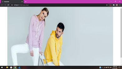

After (using container fluid):-
Bootstrap is work on container and fluid is the main properties

that contain row and col bootstrap contain 12 col.Example:-div class="container">


many other properties:-
1) Display-Flex:- useing this property many Quickly manage the layout, alignment, and sizing.2) flex-basis :-using this property equel size destribute.
3) Justify-contain-center:using this property text/img in center.
4)flex:1:-use this property for any text in one line.
Bootstrap Provide many class and css property for development of responsive web pages.
Flex-BoxesBefore the Flexbox Layout Module, there where fore layout modes:- Block, for sections in a webpage
- Inline, for text
- Table, for two-dimensional table data
- Positioned, for explicit position of an element
The Flexible Box Layout Module, makes it easier to design flexible responsive layout structure without using float or positioning.
Example:-


CSS Flex-Container:-
The flex container becomes flexible by setting the display property to flex:
Example:-.flex-container {display: flex;
}
flex-direction property defines in which direction the container wants to stack the flex itemsflex-direction: column;
}

flex-direction: column-reverse;
}

flex-direction: row;
}

flex-direction: row-reverse;
}

flex-wrap property specifies whether the flex items should wrap or not. The examples below have 12 flex items, to better demonstrate the flex-wrap property.
Example:-
The wrap value specifies that the flex items will wrap if necessary:
.flex-container {
display: flex;flex-wrap: wrap;
}

flex-wrap: nowrap;
}

flex-wrap: wrap-reverse;

flex-flow property is a shorthand property for setting both the flex-direction and flex-wrap properties.flex-flow: row wrap;

justify-content property is used to align the flex items:justify-content: center;
}

justify-content: flex-start;
}

justify-content: flex-end;
}

Grid Container
To make an HTML element behave as a grid container, you have to set the display property to grid or inline-grid.
Grid containers consist of grid items, placed inside columns and rows.
The grid-template-columns Property
The grid-template-columns property defines the number of columns in your grid layout, and it can define the width of each column.
The value is a space-separated-list, where each value defines the width of the respective column.
If you want your grid layout to contain 4 columns, specify the width of the 4 columns, or "auto" if all columns should have the same width.
Example
Make a grid with 4 columns:
.grid-container {
display: grid;
grid-template-columns: auto auto auto auto;
}

The grid-template-rows Property
The grid-template-rows property defines the height of each row.
.grid-container {
display: grid;
grid-template-rows: 80px 200px;
}

The justify-content Property
The justify-content property is used to align the whole grid inside the container.
.grid-container {
display: grid;
justify-content: space-evenly;
}

.grid-container {
display: grid;
justify-content: space-around;
}

.grid-container {
display: grid;
justify-content: space-between;
}

.grid-container {
display: grid;
justify-content: center;
}


Comments
Post a Comment